Learn Flexbox properties by heart
I'll admit, every single time I needed to use Flexbox, I had to google the docs to remember which property does what, and where it should go.... Frustrated, I decided to escape this cycle and just learn it by heart.
If you've found yourself looking up "flexbox cheatsheet" more times than you'd like to admit, this summary is for you. I've distilled down what I learned, so you too can master it once and for all.

Playground
I've created this practical playground alongside this article to experiment with Flexbox properties. Feel free to play around with it by tweaking and testing these properties. This will enhance your understanding.
Flexbox wording and properties
Think of the flex container (parent element) as a box holding several smaller boxes (items). How these small boxes align and order themselves depends on the rules set by the container.
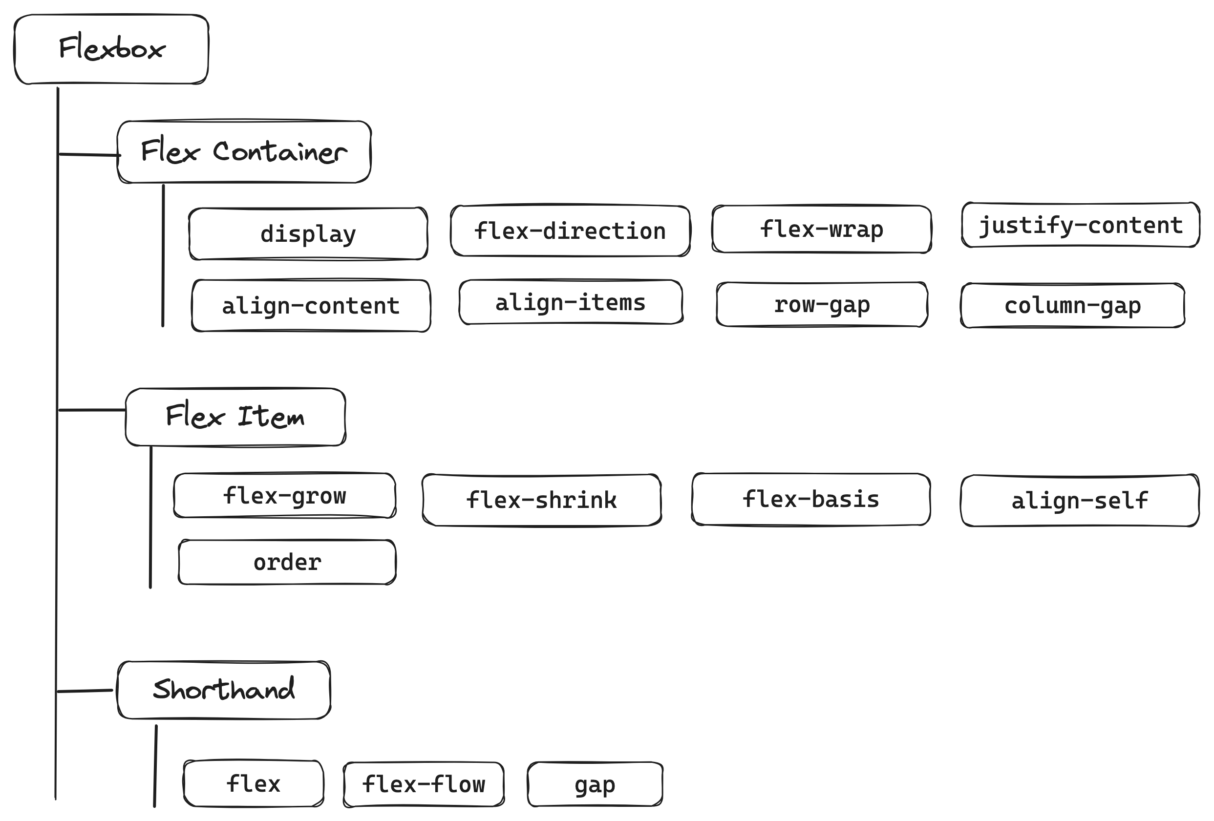
When delving into its properties, one can identify them as falling into three categories as shown on the image above.
- Flex Container Properties: designed to control the overall layout behavior of the flex container itself.
- Flex Item Properties: focus on the layout and alignment of individual items within the flex container.
- Shorthand Properties: provide a quicker, more concise method to define multiple flex attributes simultaneously.
In this article, I won’t develop shorthand as I do not use them. A way for me to remember each property and master their nuances is to use the verbose form and set each property.
Flex & inline-flex
To start using Flexbox, we simply add display: flex to our container. There's a special scenario where we use inline-flex to have similar behavior to inline-block and align two blocs.
This can be a bit tricky, especially when used next to text. The flex container uses the baseline to align both blocs but it has diffucult time to get it right. To keep everything aligned nicely, we often need to use vertical-align: top or vertical-align: bottom on both blocs.
Row & column
In Flexbox, the flex-direction property determines how child elements, or flex items, are aligned: when set to row, items are aligned horizontally, side by side, while column aligns them vertically, one below the other. In some documentation they use main axis and cross axis. I found this a bit confusing and prefer thinking of it a in a spreadsheet:
- Row: horizental as a row in a spreadsheet.
- Column: vertical as a column in a spreadsheet.
Justify-content vs align-content vs align-items
I my opinion these three properties are the most confusing and also where most of the magic happens.
justify-contentposition all child elements as a single unit within the container along the main axis defined by the flex direction. Whenflex-directionis set torow,justify-contentcontrols the horizontal alignment of items, distributing them evenly across the container's width. Conversely, withflex-directionset tocolumn, it manages the vertical alignment, arranging items along the container's height.align-contentfunctions similarly tojustify-contentbut operates along the cross axis, which is vertical Whenflex-directionis set torow. It's crucial to note thatalign-contentcomes into effect only in multi-line scenarios (multiple rows whenflex-directionis set torow). This situation arises whenflex-wrapis set towrap, allowing items to flow into additional lines. In cases where there's only a single line, the alignment of items along the cross axis is controlled byalign-itemsinstead.align-itemsmay seem equivalent to align-content as it positions items along the cross axis as well (vertical whenflex-directionis set torow) but has a distinct function. It adjusts how items are positioned within their individual row (or column), This property does not consider the entire container, but rather focuses on how items are positioned within their specific row. Effective in both single and multi-line layouts.
In a nutshell, while align-items focuses on the positioning of items within their line, align-content manages the distribution of all lines as single unit within the flex container.
Stretch vs Stretch
Both align-content and align-items can have the value stretch, but they apply this behavior in different contexts:
stretchinalign-items: Applies to individual flex items. Each flex item stretches to fill the entire cross-axis space (vertical when flex-direction is row) of the line they are in. If the item doesn't have a set cross-axis size (like height in a row or width in a column), it will stretch to fill the entire height (or width) of the line. It's effective in both single-line and multi-line flex containers.stretchinalign-content: Applies to the entire group of lines within the flex container. the lines of items in a multi-line flex container stretch to take up the available space along the cross-axis. If there's extra space in the container, this setting distributes that space equally between the lines. Only effective in multi-line layouts (i.e., whenflex-wrap: wrapis used and there are enough items to form multiple lines).
In a nutshell, stretch in align-items is about stretching individual items within their line, while stretch in align-content is about stretching the spacing between lines in a multi-line container.
Happy coding
In closing, I hope this guide serves as a helpful stepping stone in your Flexbox adventure. I invite you to continue exploring and playing with the Flexbox playground. Your feedback and insights are always appreciated. Happy coding! 🌟👨💻👩💻